
I can save an excellent educational video today and still lose the useful part of it next week.
The video is still in my bookmarks.
The explanation I wanted is buried somewhere inside 47 minutes of content.
That friction became one of the reasons I started building ScribeShot.
Saving the source is not the same as saving a path back into it.
Bookmarks solve storage better than retrieval
A bookmark works when the question is “Where is that video?”
It works much less well when the question is “Where was the part about vector databases?” or “Which example explained that API idea?”
I kept saving useful videos and then repeating the same search later.
That changed the product problem for me.
I did not need another place to store videos.
I needed better retrieval inside them.
Chapters turn “where was it?” into “which part?”
One ScribeShot view organises a video into chapters in the sidebar.
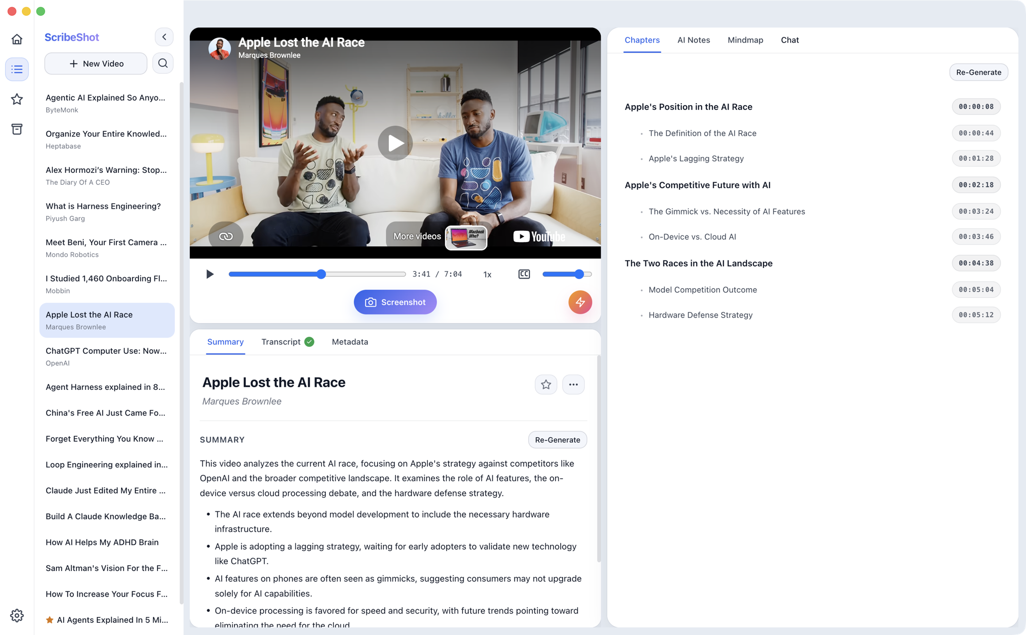
The useful part is not that AI can create a list.
The useful part is that a long video gets a visible shape.
Instead of scrubbing through a timeline, I can decide which section deserves another look.
That is a small interface change, but it changes the learning behaviour from searching again to returning deliberately.
Highlights are useful only if they lead back to the full idea
ScribeShot also has a short-mode view for video highlights.
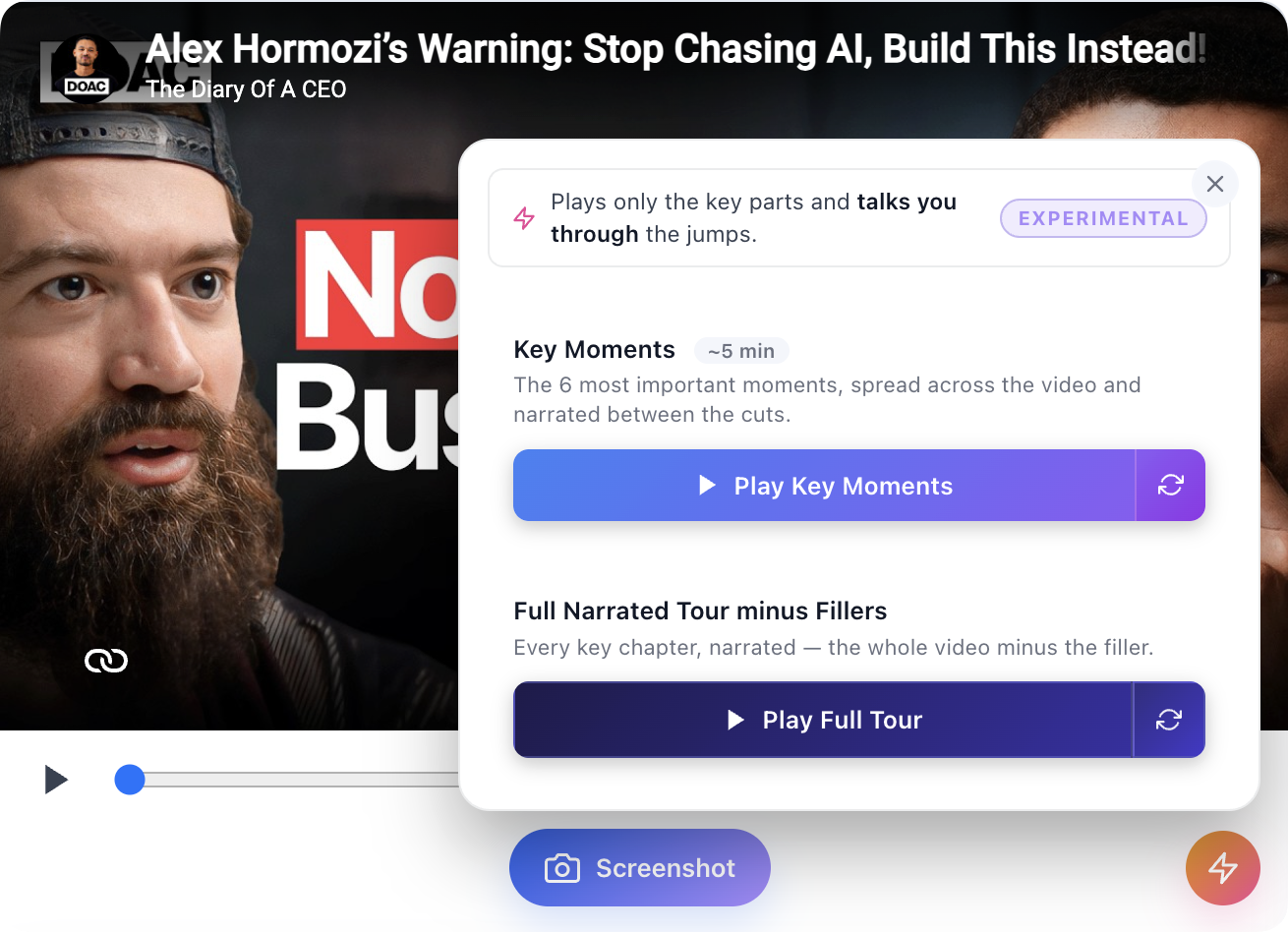
This feature has an obvious failure mode.
If short mode becomes “give me the answer without the explanation”, it removes too much.
If it becomes “remind me which parts are worth reopening”, it acts as an index into the source.
The interface is almost the same.
The intent is different.
Recall first, retrieval second
I like a simple sequence when revisiting material:
- Recall: Try to explain what I remember without opening anything.
- Locate: Use chapters, screenshots or notes to find the exact gap.
- Return: Rewatch only the part needed to repair the gap.
The tool then becomes a retrieval aid rather than a replacement for memory.
I do not have to choose between rewatching the whole video and trusting a summary.
I can return to the source at the point where my understanding becomes weak.
The metric I care about is not how quickly the tool summarises
AI learning tools are often demonstrated by showing how quickly they can compress content.
I am increasingly interested in the opposite direction:
How quickly can the tool take me from a compressed note back to the full source?
That is a less impressive demo.
For me, it is a more useful product property.
A good learning tool should not make explanations disposable.
It should make the useful ones easier to find again.
 ThinkBySketch